This could be read as ON PARKING depending on where you are standing. When I saw this freshly painted sign it took a minute to register that there was something wrong with it.
This is a good example of how repetition of material, placement and message can create a symbol that is understood without reading the text.

On Parking?
21 03 2011Comments : Leave a Comment »
Categories : Observations
Canstruction Vancouver 2011
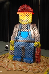
7 03 2011Canstruction is a fun way that the Society for Design Administration (SDA) brings the construction and design community together. Sculptures are built out of non-perishable food items which are then donated to the food bank. This year Canstruction has managed to collect 960,000 cans of food.
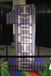
One of the interesting things from a design perspective is how you can incorporate the label in your design. Participants are encouraged to make use of the items as purchased and not alter or remove the labels. The cans present as a very large pixel size so you need to think about this carefully if you are going to use any lettering in your design. If you are going to have any smooth curves in your text you will either have to have a very large sculpture or a small can to work with.
Below are some examples of this year’s entries that have attempted to add some text to their design.
Here are a few sculptures that don’t have any text built into them but have very nice presentation of colour and shape. Note that the eyes in the “Minion” sculpture would not count towards judging because they are not an edible item.


Comments : Leave a Comment »
Categories : Observations

