Infographics – a Really Smart Way to Organize Data

3 01 2014
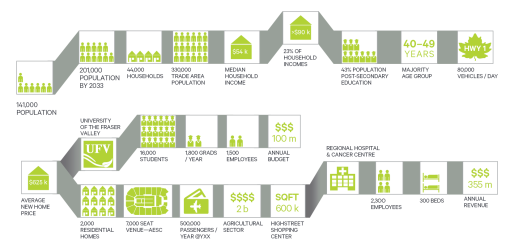
Infographic for a development brochure.

Infographic for a development brochure.

I was fortunate to I have had both the space and time available to add this info graphic in a brochure I built. It was just what I needed to add some visual interest to the brochure. The subject matter being only a concept at this time only offered a location map, some stock images and a good deal of data to express. I would like to share this article from creativepro.com

They offer some nice samples of well designed infographics that you might also find inspiration from.


Happy Mistake – Monolith Breakdown

16 04 2011

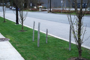
After an evening exposed to the elements a few things happened to my majestic monoliths.

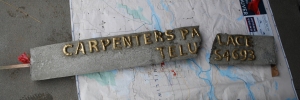
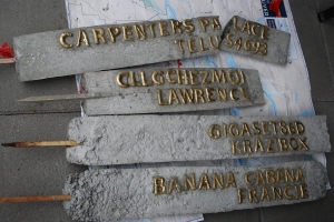
One of them toppled over and broke; the weight of a slightly crooked post was too much for the tiny wooden stake. The concrete post broke into two pieces.

Now I have two posts left that are still in one piece.

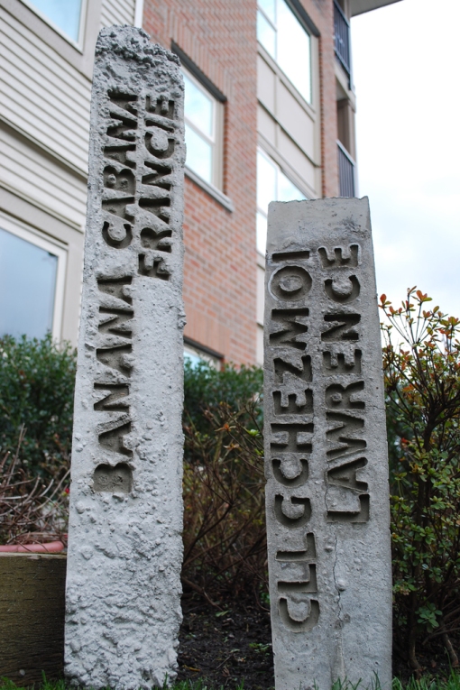
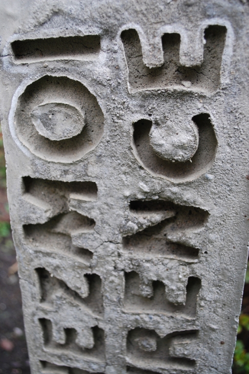
The damp air combined with the moisture of the concrete caused the baked letters to become very spongy. Much to my surprise it was very easy to pull the letters out of the concrete, leaving their impression behind. Although most of the counter spaces came out with the letters the effect was quite nice. This was the effect that I wanted from the beginning, but I decided to leave the letters dry in place in rather than try to negotiate the setting time of the concrete.


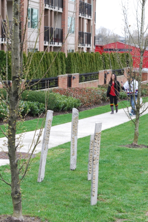
While the installation was in place I had the opportunity to witness a few people actually pull over to take a closer look at the posts. It was nice to see that they did not go completely unnoticed.


Hey!? Is That My Wi-Fi Network?

15 04 2011


Release the Monoliths!

15 04 2011


These concrete posts have had a little while to cure, it is time to remove them from the safety of their cardboard forms.

First one out!

Oooops, the first casualty!

The wooden stakes sticking out from the bottom of the posts makes me think of popsicles.

On to the next step…The installation in the Wi-Fi zone.


Wi-Fi Markers – the Creation of Mini-Monoliths.

14 04 2011

Stone. Marble. Concrete. All solid, durable materials used to display public decrees and political messages conveying a sense of authority and power. Consider the Trajan column in Rome, erected to commemorate the Roman emperor’s victory. The craftsmanship of carefully carved letter forms, prominent placement in the city and the impermeable material all reinforce that this is an important message that will be unchanged for centuries.

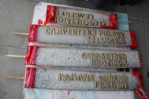
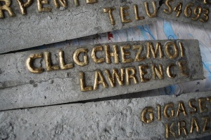
These Wi-Fi markers challenge the cultural semiotics that suggest communications carefully placed in a permanent material such as concrete has significant value. In this case the message is relatively useless to the passerby. A listing of network names pulled from Wi-Fi signals in the area. Signal strengths are deliminated by pole hieght, the text is right justified and runs vertically up the post. Golden letters placed in concrete listing Wi-Fi networks that you may or may not be able to access.

Probably the only person these networks names might have any meaning for, is the owner. The creator of the network names may find it both interesting and disturbing to witness, what was previously assumed to be invisible, materialize in these mini-monoliths announcing the presence of their personal Wi-Fi networks.

The following images outline the story behind the creation of the Wi-Fi markers.

First all the letters where printed to size and cut out to create the template. Then each letter was “carved” out of the modelling clay. I had originally used a brown flour, while it may be more healthy it did not create the nice smooth texture that white flour allowed for.

This set of letters is ready to be baked. I cut out and baked close to 100 letters for this project, and not all of them made it through quality control.

Metallic spray paint applied to the baked white letters will give these a shiney metal look.

Finally all my letters are ready. On to the forms for the posts.

This builders tube typically used for pouring concrete columns will be used as the forms for the Wi-Fi markers.
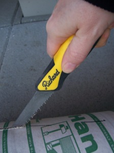
The tube will first be cut lenght wise, and then the half circles will be cut to two different hieghts of 3′ and 2′. I started with a hand saw blade but needed to be finished sometime before the end of May.

I upgraded from a hand saw to a sawsall so I could cut the forms out a little quicker.
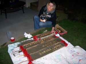
With the concrete poured and evenly spread there was no time to waste carefully placing the letters. The aggregate in the concrete made it a little difficult to have perfect kerning between the letters, it seemed there was always a pebble in the way that I had to wiggle around. It is getting quite dark at this point, and the laser beam looking device I am holding is actually a lantern.

Nothing left but the curing. Now I wait for it to stop raining, the next step will be to cross my fingers and hope that it doesn’t fall apart when I peel off the cardboard form.


Home Baked Letter Goodness

21 03 2011

I have been thinking about how to get the text impression into the concrete posts that I will make for my independant project. First I was looking at the alphabet fridge magnet collection. However the counter spaces are a little too tight for pressing into concrete and I would like more control over the final size of my letters. I found some cookie cutter shapes that have numbers and letters, but they were not in stock at any of the Michael’s stores I called. I could get them from Bed Bath & Beyond if I wanted to wait two weeks. But I would still have no control over the size or the font selection.

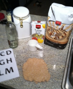
Baker’s clay is the answer. It is cheap and easy to make, plus I can carve out my selected font to whatever size I need. I will try Candara because it looks like an inscriptional letter-form with flared ends, with any luck that should make it easy to build with the tools I have on hand.


All you need is 4 cups of flour, 1 cup of salt and 1 1/2 cups of water. The wine bottle is my rolling pin. I don’t have room to store a rolling pin but I always seem have an empty wine bottle handy.


Candara letters all cut out and ready to be used as a guide. The dough smells a lot like play-dough.


All set to be put into the 300 degree oven for aprox. 30 minutes.


The final product, not suitable for consumption. The stencil paper was pretty thin making it too easy to push the stems and cross bars of the letters around which is probably what allowed the top of that “E” get so distorted. Not too bad for my first attempt at baked alphabets.


Theory Thoughts

19 03 2011

In class I saw an image from a project which brought invisible Wi-Fi networks to life with a form of light painting created from walking along with a light bar that would turn more lights on as the signal increased. The effect was a light-fence that would peak and recede.

This image of this light-fence got me thinking “this looks so cool, how I can use this in my independent project?” In class discussion Tak mentioned pulling out the Wi-Fi networks out from the surrounding area and noting them visually. I think that rather than using a Kanye tweet, or random facebook status update, why not use something that you cannot see and turn it into a mile marker.

I will pluck out the names of Wi-Fi networks within range, and then label the mile markers with them. A way to make these even more visible would be to add some light painting to the image of the mile marker. Taking a long exposure image of the mile marker while some volunteers toss throwees at it should create a glowing network of lines attached to the markers.

My project is based on material and how the message can be seen as more important when it is placed on a substantial material. The theory is based on the symbiotics built around a concrete mile marker. The permanence of the material relates that the message must be important and should be noted. I will bring attention to something that you can’t see or feel and would otherwise not give any consideration to. I also intend to make the invisible, visible, the neglected, noticed. Imagine a map of all of the Wi-Fi systems, and what that could look like? Will creating mile markers and mapping out their existence make these networks seem much more important and noteworthy?


Material List

16 03 2011

I have figured out most of what I need now to start building my final project.

Here is my list of required materials:
3 – 8′ builders tubes
1 bag of ready set concrete
big plastic pail
aprox 24 sign plates
sheets of clear adhesive printer friendly stickers
1 roll of strapping tape
~20 10mm LED’s various diffused colours
~20 2032 lithium 3v batteries
velcro
3 eager to work for free volunteers
2 bottles of wine in case the volunteers are not-so-eager to work for nothing


Sign Switch – Test

8 03 2011

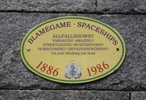
This is a sign as you leave the Burrard SkyTrain Station. I wonder how many people would notice if I were somehow able to swap out the signs. See the before and after photos.

Before Kanye's Tweet

After Kanye's Tweet


Independent Project – First Thoughts

28 02 2011

*A sample mile-marker with set text that has a usefull purpose.

I am starting to really think about this project and how it will all come together. Hopefully the mercury will get out of the negatives soon and I will be able to pour my first concrete slab for testing.

I intend on making some sort of slab, or mile-marker type shape out of concrete and either place an engraved plaque on it or stamp letter shapes directly into the surface. The message needs to be as unimportant as possible. Kanye West’s tweets were mentioned. I like this idea because there seems to be a trend of following Kanye West’s tweets and repurposing them, such as singing them, or even putting them into golden frames.
Placement of these concrete structures will also be something I want to work with. The implication that these are very important messages through the use of material and placement is my goal on this project.

I spotted an official sign this morning as I came out of the skytrain and wondered what it might look like if I swapped out the text for a Kanye West tweet, mimicking the fonts and sizes exactly. I could take a photo and replace it with the Kanye West version in Photoshop. I may explore this idea further.

*Image source: Flicker: Christopher Busta-Peck
http://flic.kr/p/2UaSmy